Last week, the media reported that the American economy grew by 1.1% in the first quarter of this year. Forbes, e.g., explained:
The Bureau of Economic Analysis said gross domestic product grew by 1.1% annually, as opposed to the 1.9% predicted. The gain was due to increased consumer spending, exports and federal government spending, among other factors.
Their economics and finance writer Milton Ezrati piled on, citing a host of numbers that supposedly explain that the economy is sleepwalking itself into a recession.
Fox Business boldly declared that the growth rate fell short of predictions, “in a sign that a slowdown is underway.” Much like Ezrati over at Forbes, they compared the first-quarter figure to the last two quarters of 2022, when the economy allegedly expanded at 3.2% and 2.6%, respectively.
This number, 1.1%, is being thrown around as the growth rate, the one that tells us what is happening in the economy and which way the economy is heading. Nobody pauses to explain what the number actually means—and how the Bureau of Economic Analysis calculates it.
The truth is that this number is highly artificial, four steps removed from reality, and part of a data series that significantly distorts the reality of what is happening on the ground in the economy.
Bluntly: the U.S. economy did not grow by 1.1% in the first quarter of this year. The actual number is not even close. Depending on which method we use, GDP either declined by 4.1% or grew by 1.9%. Either number is closer to reality than the official 1.1% figure.
Before we get to the real numbers and why they are so vastly different, let us find out what is wrong with the number that is circulating in the media.
It is regrettable yet understandable that the media put the 1.1% figure out there, and that they do it in unison. Like the buyer of a time-share condo in a popular tourist town, the writers at Forbes and Fox Business (and other news outlets) forget to read the fine print in the press release from the Bureau of Economic Analysis that started it all. Under the chart that is prominently pasted in the middle of their press release, it says loud and clear that these numbers are “seasonally adjusted annual rates.”
This means that the BEA has made a total of three modifications to their data on first-quarter economic activity. Each one of these modifications puts distance between the consumer of the data—all of us who want to know things about the American economy—and the real world which the data is meant to represent. The first three of their modifications are:
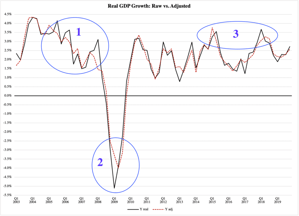
The BEA takes two more steps before they present their numbers to the public, but let us wait with those steps. Figure 1 compares the raw data, adjusted only for inflation, and the data that we have once the seasonal adjustment and the annualization have been completed. The black function represents the raw data and the dashed red line represents the seasonally adjusted, annualized numbers. The difference is compelling:
Figure 1

Source of raw data: Bureau of Economic Analysis
The use of seasonal adjustment and annualization, i.e., the dashed red function, dampens the actual swings in the business cycle (1), underestimates the severity of recessions (2), and distorts the timing of shifts in economic activity (3). This is no small set of problems, given that the BEA’s 1.1% growth figure belongs to this category (though as mentioned, they did more to it than is represented here).
It is essential that we all understand the impact of using different methods for calculating GDP growth. When policymakers get the impression that business cycles are weaker than they actually are, fiscal and monetary policy measures will get the wrong ‘dosage.’ Government uses fiscal policy (taxes and spending) to improve growth when the economy is slow; central banks use their interest rates in part for the same purpose.
If economic experts use the wrong set of GDP data, i.e., if they tell policymakers that the growth rate is slower than it actually is, then we can end up with tax cuts or increases in government spending that exacerbate swings in GDP. The economy can become more unstable, but we also risk higher inflation. When tax cuts or spending increases are larger than they would have to be, the economy will be pushed into a demand-driven inflation cycle.
Even worse: when the adjusted data conceals the real size of GDP growth, the central bank may end up cutting interest rates too much. This can drive inflation in consumer and labor markets, but its most serious impact is usually on asset prices, e.g., real estate and stocks.
The last point is essential, especially from an American perspective. In the first period in Figure 1, the U.S. economy experienced speculative levels of inflation in real estate. The root cause was excessively expansionist monetary policy, ill-timed on the heels of aggressive tax cuts. On top of that, federal government spending growing at 6-6.5 percent per year.
Most of the monetary expansion in the 2000s was driven by the first wave of so-called ‘quantitative easing’ by the Federal Reserve. The QE programs were not primarily motivated by erroneous readings of economic growth, but the biggest problem is not what information policymakers use. The biggest problem is that anyone critical of irresponsibly expansionist economic policies, whose eyes were on the wrong set of GDP data, missed the best arguments against said policies.
Interestingly, just as much as the focus on adjusted data can lead to over-active economic policy, it can also motivate policymakers to underactivity. As shown by the second episode in Figure 1, the adjusted data never reported the actual severity of the so-called Great Recession in 2009-2010. Although it is generally inadvisable for governments to try to stimulate an economy in recessions, there are exceptional circumstances such as depressions, or very rapid, multi-faceted recessions, where small measures of policy intervention can be motivated.
These measures can be critical to the turning around of the economy. The reason is simple: a deep recession that unfolds rapidly wipes out confidence across the economy, in product, labor, and equity markets alike. Decision-makers across the private sector do what they can to save what resources they have, so that—in the words of economist Paul Davidson—they are “saved to make a decision another day” (see his eminent Money and the Real World). This means that economic activity gets stuck at the very depth of the economic crisis.
In this situation, government has a small window to make a meaningful difference, a window where the policy timing and ‘dosage’ are critical components. To work with the wrong data at that point can lead to fatally erroneous policy decisions, by legislators as well as by the central bank.
As episode 2 in Figure 1 shows, the adjusted GDP data not only got the severity of the recession wrong, but also the timing of its low point.
The timing problem is further highlighted in episode 3, where peaks in economic growth are off by as much as six months. That is a long time in economic policy, especially for quick-moving policy institutions like the Federal Reserve. If it raises the interest rate too early, it can thwart an economic recovery; if it raises its rate too late, it may hit the economy when it is already in a downslope, thus exaggerating a fledgling recession.
Most of the deviations in the two series of data in Figure 1 are within fractions of a percent. But is the difference between 3% and 3.5%, as in episode 1, really that important? Is it not just a futile exercise in rhetoric to belabor the difference?
No, it is not. One-half of one percent of GDP can be measured in millions of jobs, created or vanished. It can be the difference between low-income families earning enough to get off social welfare or having to continue to rely on government. In a deep recession (episode 2), the difference between -4% and -5% can be the difference between the central bank doing enough and doing too little to help the economy back on track again.
In short: when the Bureau of Economic Analysis releases modified data, as opposed to the closest thing it has to raw data, it lays the groundwork for mistakes of all kinds in economic policymaking.
It is worth noting that no other statistical agency uses similarly modified data. The Bureau of Labor Statistics does adjust its employment figures for seasons, but it does not annualize its numbers the way the BEA does. However, the BLS does publish the same type of raw data that the BEA provides, which makes it easy to do broader economic analysis with consistent series of data.
Every time the BEA chooses its modified data over its raw data, I am perplexed. I am even more perplexed since, as mentioned, the 1.1% figure they report as GDP growth this year, is nowhere near reality, which we noted was either -4.1% or a positive 1.9%.
Which one is it?
Before we get there, let us go through the last two steps of data adjustments that the BEA does on its way to its public GDP growth figure. The numbers compared in Figure 1 are the raw GDP data, adjusted only for inflation, and the same data adjusted for inflation and seasons, then annualized. The GDP growth rates for the first quarter of 2023 that come out of these two sets of data are, respectively, 1.9% and 1.6%.
Again, the BEA reports a number of 1.1%. What is missing here?
To reach that number we need to put our GDP data through two more statistical grinders. The first one produces not a year-to-year growth rate, but a quarter-to-quarter figure. The second step multiplies this growth rate by four.
This is done to make the quarter-to-quarter growth rate look like an annual growth rate. It allows the BEA to show what the growth rate would be if the quarterly rate was annual.
Yes, this is really how it works. They take the raw GDP data, then
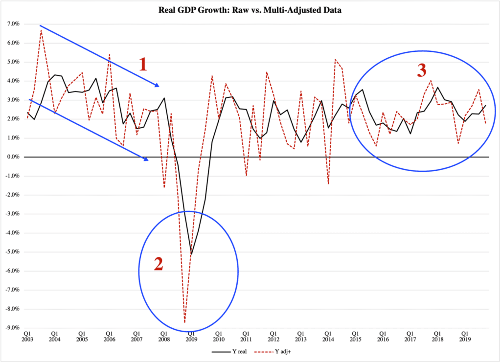
This is completely unnecessary, especially since they publish the raw data on their website, along with all sorts of adjusted data. Yet they choose to publish the most distant-from-reality form of GDP numbers they have. As Figure 2 shows, once we put those numbers to work, things go haywire:
Figure 2

Source of raw data: Bureau of Economic Analysis
The red dotted line gives us the officially reported GDP numbers, including the 1.1% GDP growth number (at the right end of the figure). With it comes an excessive business cycle, with markedly bigger swings than the real numbers along the black line (1). This gives the impression of a volatile economy and can motivate more active fiscal and monetary policies than would otherwise be merited. A deep recession is made to look much worse than it really is (2).
What crisis measures can you not convince Congress to pass if the recession is made to look this bad?
Even when the economy is operating under relative stability (3), the multi-adjusted GDP data can significantly misrepresent reality.
If we calculate year-to-year growth in GDP, adjusted for inflation but nothing more, we find that it is up by 1.9%. If we only calculate growth from quarter to quarter, the economy was 4.1% smaller in Q1 this year than in Q4 last year.
So there you have it. Take whatever number you want, and run with it. Just remember to be honest about what information it conveys.
